Homepage Growth Sandbox
As Creative Director, I led the redesign of Lightspeed’s homepage, transforming it from a static brand page into a modular, test-driven growth engine. The existing experience lacked clarity, felt outdated, and limited our ability to experiment. I repositioned the homepage as a growth sandbox, focused on improving messaging, increasing engagement through motion, and enabling faster iteration through scalable components.
Web Design
Homepage Growth Sandbox
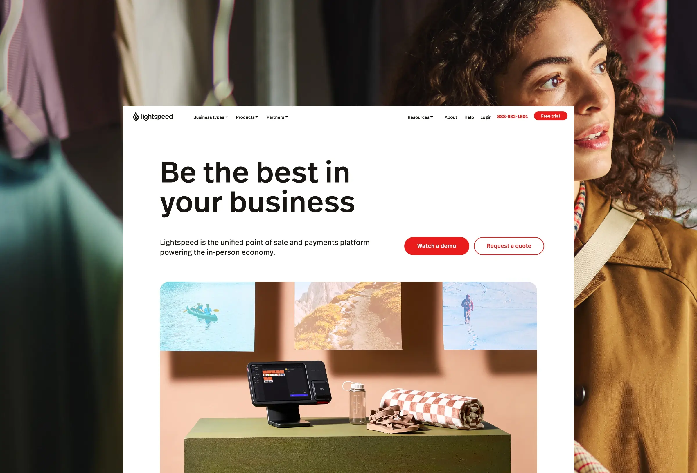
The Lightspeed homepage is one of the most visited and highest-stakes pages in the business, a hub that receives large volumes of paid traffic across every stage of the funnel, from top-of-funnel visitors exploring verticals to bottom-of-funnel users ready to book a demo. Despite its importance, a design audit revealed a number of critical gaps: an unclear value proposition, weak visual hierarchy, outdated design language, generic messaging with no industry-specific relevance, and an existing build that severely limited the team's ability to experiment and iterate. Entering FY26, it was clear the homepage no longer reflected the brand's evolved direction and that it needed to become a platform for continuous learning, not just a static marketing page.
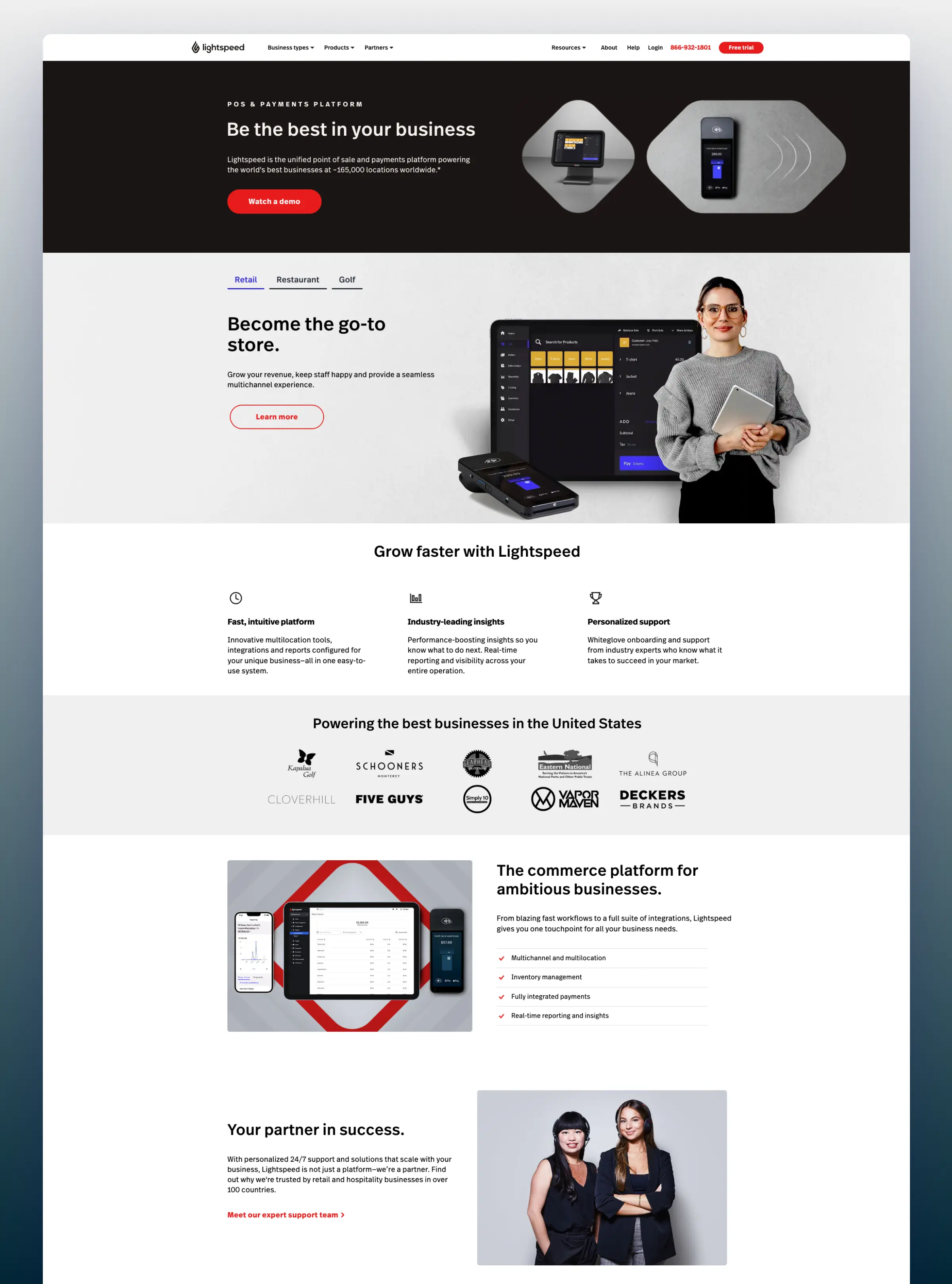
As Project Owner and Creative Director, I led a cross-functional team spanning Growth, Web Dev, Motion Design, Content, Product Marketing, and Project Management to reimagine the homepage as a modular, test-ready experience. The strategy was built around three aligned priorities: tailoring messaging and narrative for the Retail ICP, refreshing the visual and brand expression to feel premium and credible, and increasing ROAS efficiency through smarter conversion design. Rather than a full structural redesign, we focused on foundational design updates including typography, colour, spacing and motion that could be shipped incrementally and validated through controlled A/B testing.
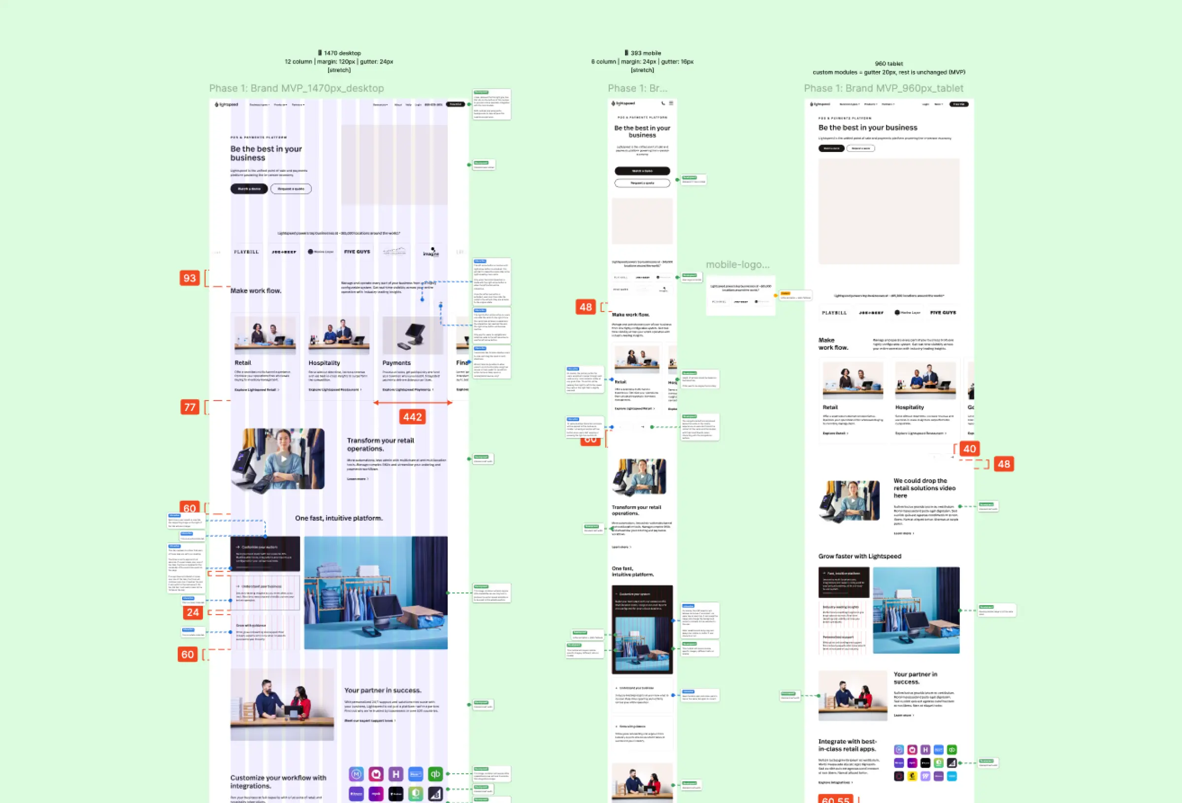
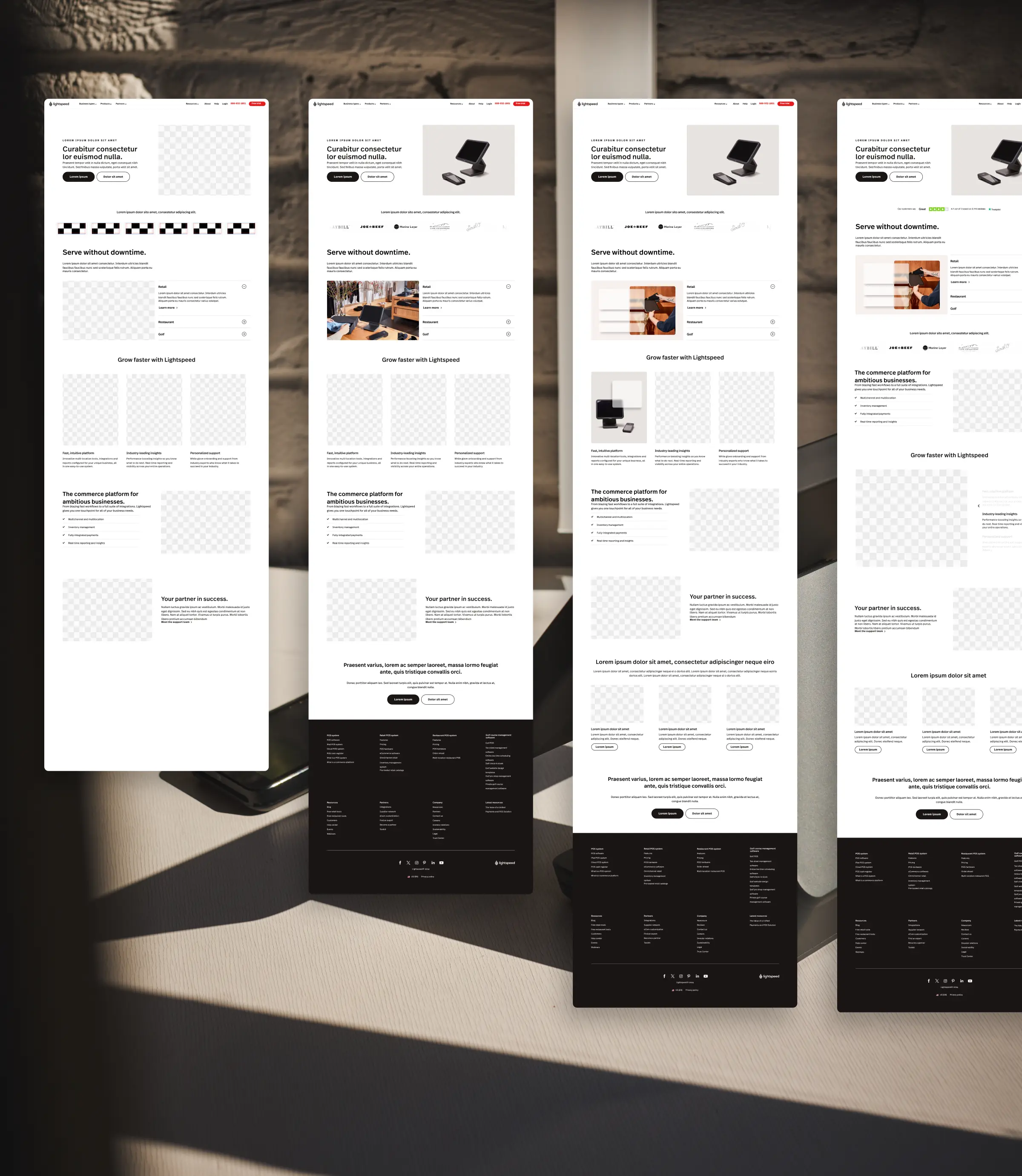
The design process was grounded in both qualitative and quantitative insight. UserTesting sessions with business owners, operators, and managers helped us stress-test key new modules across desktop and mobile, while heatmaps and CRO data informed hierarchy and messaging decisions. Through multiple design iterations, we introduced subtle micro-interactions, a modernised layout with clearer content architecture, an industry selector module, and a refreshed hero with stronger CTA contrast and copy. Each component was built to be modular and swap-ready, laying the foundation for faster, lower-effort experimentation in future phases.
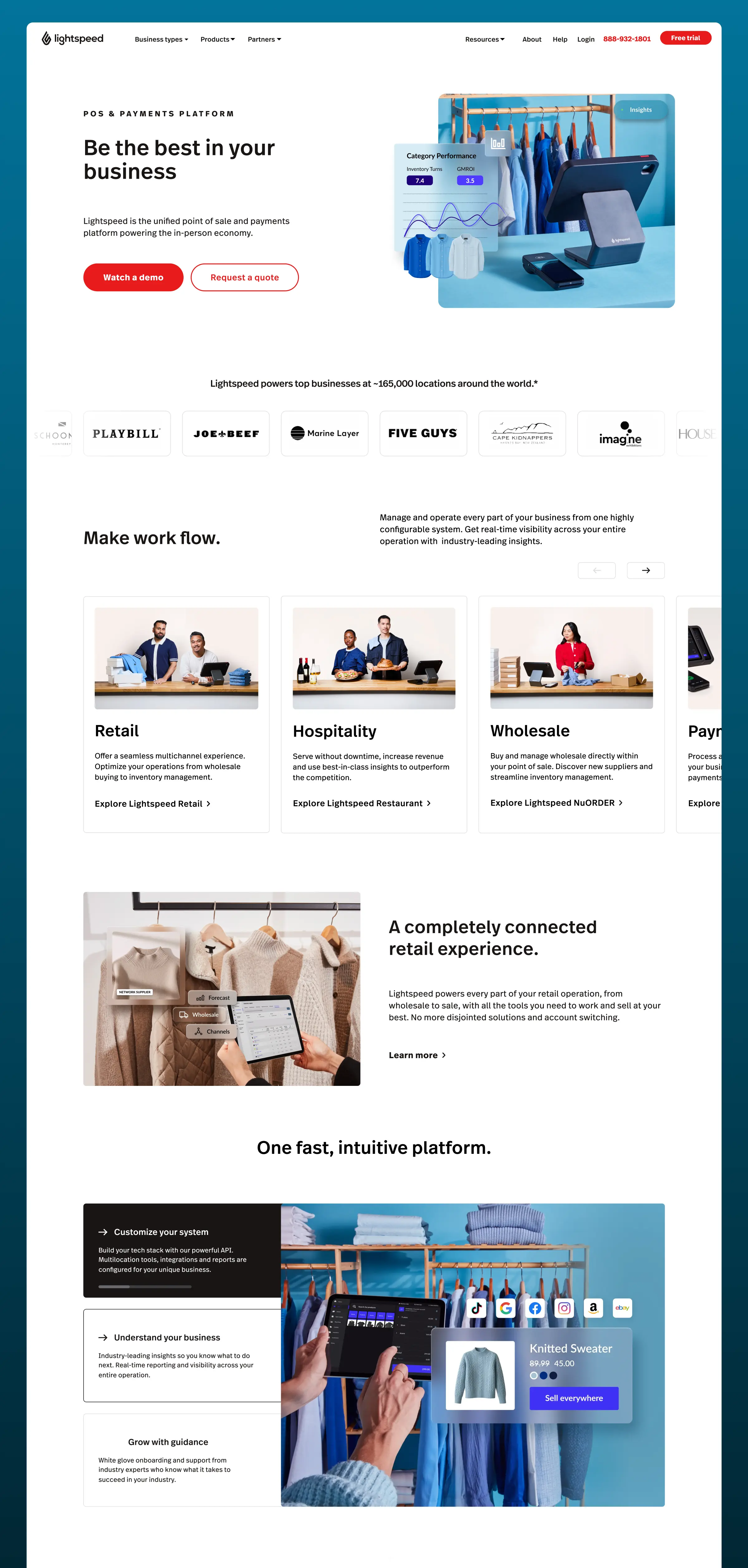
Once pushed live by the CRO team, the results validated the approach across the board. On-page BOFU form submissions increased by 10.45%, on-page form opens and CTA clicks rose 21.20%, and on-page body non-form CTA clicks saw a remarkable +2,000% lift, driven by the introduction of micro-interaction-enabled tertiary CTAs across the page. Visits to retail and industry pages also increased, reflecting stronger content relevance and improved navigation clarity. The project proved that design-led experimentation, when built on a scalable system and clear hypotheses, can meaningfully move business metrics while setting up a compounding foundation for growth.
