Client: Kounta
Description: Recipe Cost Calculator
Role: Lead Growth Designer
Services: UX | UI | Product Led Growth
This was one of my favourite challenges I got to work on at Kounta when I was part of the growth team. The goal was to help promote and increase adoption of a powerful back of house hospitality product, Produce. This app allows users to input ingredients and batch recipes, better understand their profits and margins and ultimately allows BOH staff to get on top of their COGs.
The challenge was trying to get new users to trial the product without being overwhelmed. Our goal became simple, give users a small taste of what it’s like to calculate your costs of goods for a basic recipe and if the experience is enjoyable, we can give them the chance to download Produce and sign up with a discount.
Screenshots of UX & UI inspiration from a mix of SAAS experiences.
How did we do it?
Competitor analysis:
I began by finding similar tools across hospitality and consumer finance industries (loan calculators). This helped me find what was currently out there (which wasn’t much) and gave me design solution ideas from tools that our audience would also interact with outside of hospitality, like home and commercial loan calculators.
leverage insights:
I had access to a bunch of qualitative data that had already been sourced through user interviews, questionnaire's and focus groups for the Produce app. So I was lucky enough to dive in and pull insights that would help inform the first information architecture and layout of the tool. I then moved on to some of the quantitative data that we could pull from existing users on Produce which gave us insight into how we should consider content flow and information hierarchy across the tool page.
Collaboration:
Working closely with the Produce product squad, I had access to all the squad members who gave me feedback, guidance and pointed me and the front-end dev to some design and code solutions.
Sign-up flow:
The Growth team and I worked together to create a sign up flow that would capture some details like business type and email. We specifically tried to make it as minimal as possible with only the necessary information being captured so users get right into the tool. In the food cost calculator experience, we had some product placement and upgrade CTAs that would point users to downloading Produce.
Photos from some notes during kick off & design WIP meetings.
Workshops and Discovery sessions with the growth team
I don’t think I could have come up with the right design solutions on my own through out this project. Having a team to bounce ideas with and explore potential solutions and concepts is what helped me make some key decisions that lead to the final layout and design of the tool.
Through diving deep into the problem and understanding what we need to make this project a success, we were able to workshop some ideas and develop guidelines and frameworks that would help me iterate through rounds of concepts, wireframes and designs.
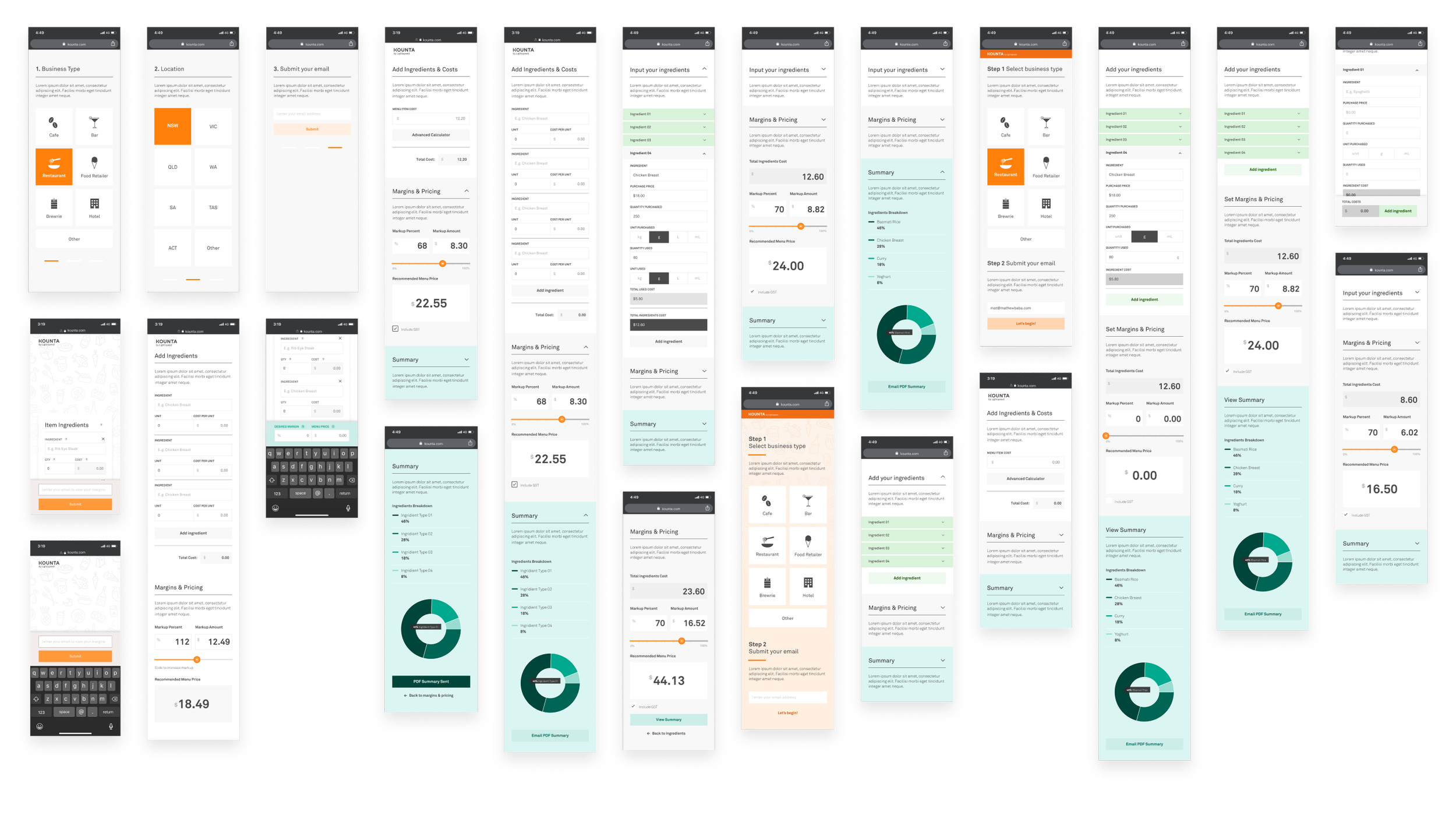
My initial mobile first design explorations
Delivering a final design and a re-skin not long after
The final product was built using react which provided us with more flexibility in layout options and responsive mobile designs. To help deliver on our app adoption targets we built in specific ads that would provide users with the option to create free Produce accounts and for those who were existing Kounta users, we delivered a separate experience which would allow them to upgrade heir account and use produce!
A mix of final design layouts, UI components and re-skinned light and dark mode screens (after Lightspeeds acquisition of Kounta).


