Client: Lightspeed
Description: Solutions focused product explainer videos for our flagship products
Role: Creative Director
Services: Creative Direction | Project Lead | UX/UI Design | Visual Design
As Lead Creative Director, I spearheaded the development and production of two flagship product explainer videos (solutions videos) for Lightspeed, one tailored for the retail industry and the other for hospitality. These videos were conceived as bold, premium, and engaging product stories to support our top to mid-funnel marketing strategy, helping to clearly articulate the value of our platform in a fast-paced, thumb-stopping format. It was also the first of many fully animated product videos that we produced since our brand refresh which included insights and learning from our recent ICP profile discovery.
From the ground up, I was embedded in every stage of the process. From crafting the initial creative brief to selecting and onboarding Never Sit Still, a renowned Sydney-based motion design studio I had admired for years. I led negotiations, secured internal approvals, and worked closely with both our internal teams and agency partners to ensure alignment with our refreshed brand identity.
Despite working with a relatively limited budget, we were strategic in how we prioritised production decisions to maximise impact. One of the key considerations was ensuring the videos could be easily localised for global markets. This led to the decision to exclude voiceover entirely, streamlining the translation process across multiple languages. It also meant using the same music track for both videos to stay within our sound design budget. While this presented challenges — particularly around pacing, timing, and maintaining a premium feel without narration, it pushed us to be even more thoughtful in our visual storytelling and how we used motion and text to guide the viewer through the narrative.
Initial storyboards for the retail solutions video
Type treatment options to help convey solutions focused messaging
Collage of initial designed boards
Designed boards for the retail solutions video
Collaboration was key due to stakeholders being located across multiple timezones, so this meant I had to create asynchronous workflows to help provide access and visibility. I set up a structured ecosystem for creative collaboration using shared Google Drive folders, Slack channels, and a public Figma workspace. Here, I contributed brand assets, UI design elements, and detailed visual direction. I also helped shape the narrative by partnering on script development and ensuring the music, SFX, and color palette embodied the premium tone we were striving for.
Midway through the storyboard phase, we hit a creative roadblock, the illustration style began leaning too bubbly and friendly, veering away from our desired premium aesthetic. With only 24 hours to recalibrate, I delivered decisive and constructive feedback, facilitated a tough but productive conversation with the agency, and backed it with visual references and design boards. This moment was pivotal in realigning the project and pushing the creative output to a higher standard.
New direction applied to designed boards
New video colour palette selection
Example of feedback applied to designed boards with focus on details
Designed boards of updated retail solutions video
One of the most rewarding aspects of this project was the highly iterative and non-destructive design process we implemented. Because of the strong collaborative foundation we set early on, I was able to get deeply involved in the finer details, specifically the motion design nuances that often make or break a premium execution. From text animations and transitions between scenes to the choreography of shapes, imagery, and footage, every movement was intentional.
This level of granularity pushed the creative output beyond the expected. It was also the most challenging part of the process, aligning motion characteristics with brand personality requires patience, precision, and trust but it’s what ultimately delivered that extra 10%. That final layer of refinement gave the videos their elevated, polished feel.
Smooth word by word super animation
Line by line super animation with a pop
Direct word by word super animation
Line by line super animation with slight overshoot (chosen style)
Intro animation styling and type treatment
Rolodex test
Trialing photography and fireball mask shape
Stacking effect with tags
Background elements test
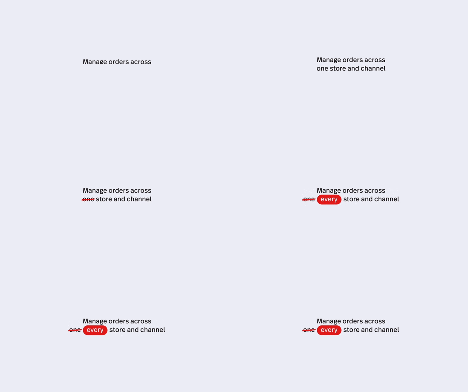
Typography treatment used to emphasis word and meaning
The final hero videos, each 1:40 in length, were delivered alongside multiple cut-downs (15s and 30s) to support social distribution. We also worked closely with our localisation team, providing them with clean, editable files for multilingual adaptation across global markets, an enormous but smooth operation thanks to the foresight and coordination in our production pipeline.
These videos have since been widely adopted across Lightspeed's go-to-market efforts: from sales enablement tools and Zoom waiting rooms, to internal and external launches, including a high-visibility premiere at our Capital Markets Day. Their reception by ELT and board members affirmed the impact of strong creative direction paired with strategic execution.
Full-length retail solutions video
Full-length hospitality solutions video


